
Riding on the creative high from the last trio of wall hangings I made, I decided to pop over to the art supplies store, purchase a larger canvas that was on sale, and create a piece for my living room. I wanted to do something reminiscent of Mark Rothko: the restraint in his simple floating rectangles painted in carefully-chosen colors allowed you to appreciate the colors for the moods they evoke and the things you associated with them, while the un-neatness of the shapes and overall simplicity of his style meant it was doable by little old clumsyhands me.
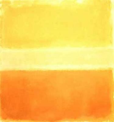
"Yellow and Gold", Mark Rothko, 1956.
But the last thing I wanted to do was to make a blatant ripoff of the master's iconic piece. I set out to make the painting my own by playing with texture as well as color, drawing out my own arbitrary proportions for the rectangles, and flipping the whole thing to a landscape orientation, as opposed to the upright orientation Rothko seemed to prefer. As for the palette, I wanted a little shot of crimson to tie in with my red Ikea furniture to liven up a vast spread of pewter and brass in the same shades as the bracelets I wear everyday:

The Number (N)ine bracelet in oxidized silver mercilessly scratches my watch, while the Giles and Brother cuff in brass has a way of making my wrist smell like old coins once in a while, yet I find myself slipping them on every morning.
Here's what I did:

I first whitewashed the entire canvas with a mixture of white acrylic and water just to give it that clean finish. Then, with a clothes hanger, no less (it is fashion-inspired art after all!), I pencilled out my rectangles in proportions that felt right to me.
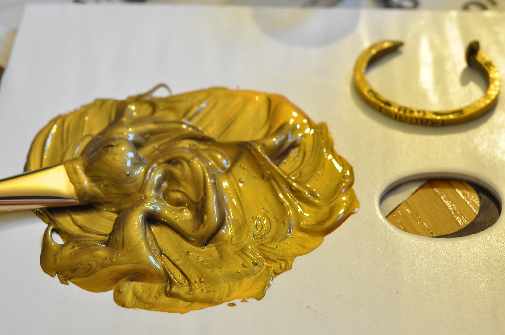
I then started to mix pigments to get that exact shade of Philip Crangi brass, which didn't take much skill at all: I really just mixed a standard gold metallic acrylic paint with a smidge of black. I then stirred in some clear granular gel medium for a rough texture almost reminiscent of rock salt (not pictured).
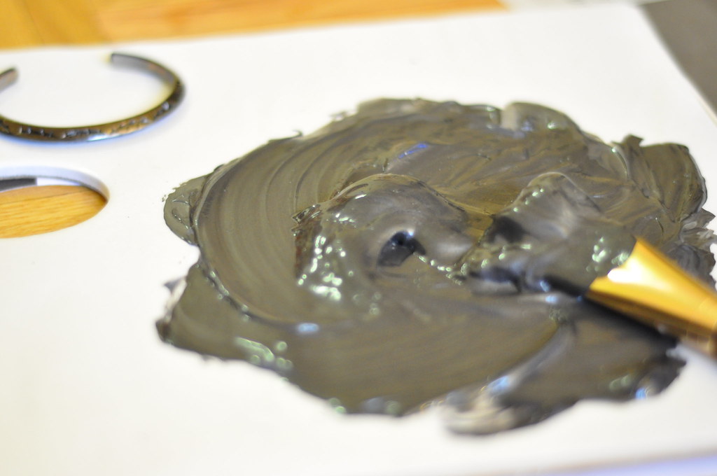
To match the oxidized silver on the Number (N)ine bangle, I used standard silver acrylic metallic paint and, you guessed it, lots of black. I also mixed in some gloss medium for extra shine.
And here is the piece done:
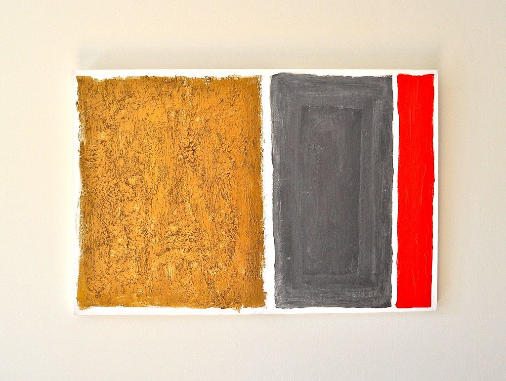
"Rothko by way of Crangi and Miyashita", acrylic and granular gel medium on canvas, 35"x24", October 2010.
I went to town with the brush on the brass section, expressively dabbing in graceful curves, and I like that the texture came out slightly reminiscent of those trees in old Chinese landscape paintings. To add depth to the rectangle in dark gray, I layered coat upon coat of diluted silver acrylic on to the border, which I then finished off with a dry brush halfway upon setting to create a subtle brushed effect.
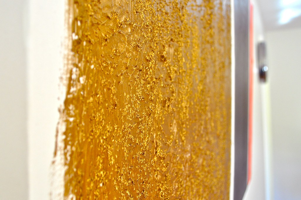
the texture up close
Upon seeing this painting via webcam on Skype, my mother remarked that she should have just commissioned me to do the paintings at her new condominium she just had furnished. I replied, "Why pay a good penny for mediocre hotel art, when you can make the same thing for much less and have it match your jewelry?"


4 comments:
I suddenly realised I should also be going back to my canvases! Painting is just a good way to get rid of stress! haha
Anyways, after forever... I finally learned how to put links on my blog! Thanks for linking me, Izzy! I have finally linked you back! :)
it looks excellent, you really did a grand job. the gold sits so well with the others, well impressed. do more! i will be doing more when my year of uni is out the way.
best blog!!!!
why thank you ^^^
Post a Comment