My fascination with watches precedes my passion for fashion. At an early age, my father and my grandfather had instilled in me an appreciation for fine timepieces: I was the odd chubby kid with a gel-spiked hairdo in elementary school who wore his steel and gold and diamond Rolex to class every Friday. IWC is one of the watch brands that I have developed a liking for over the years; their watches are subtle yet substantial, and the designs classic and harmonious. I had the honor of interviewing IWC's creative director Christian Knoop, and the delight of playing wrist dress-up at the IWC headquarters in New York, both of which I share with you today.
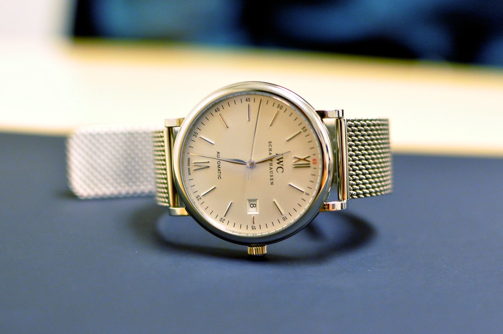
the Portofino Automatic in steel, with a silver dial: a great example of the classic subtlety that is IWC. I'm pinching my pennies for this one.
Tell me about yourself, and your role at IWC.
I’m a designer by heart. I started drawing and sketching and building things already as a child and wanted to become a designer at the age of 12 already. After a carpenter training, I studied industrial design in Germany and spent more than 10 years working for various international creative agencies focusing on product design, innovation engineering and brand consultancy. I joined IWC as Creative Director in 2008, heading the internal design Team at the headquarters in Schaffhausen. It is part of our strategy to have an internal team taking care of all brand related design elements. I’m working with a great team of international design talents on all these items. For sure the watch design is the central part of our job, but we work on Corporate Identity, stationary, all marketing materials, point of sale displays, Shop in Shop design, up to gifts and packaging, as well.

IWC's creative director Christian Knoop
In your line of work, how do you find inspiration?
Most designers will say they find their inspiration in the art or architecture. As I said, I enjoy working on all aspects of the IWC brand and the field of inspiration can be as wide as my field of work. There are many fields I’m interested in and that I find inspiring such as movies, theater, photography, craftsmanship and fashion. With regards to our collection I often find great inspiration in our archives and in the rich history of this more than 140 years old brand.
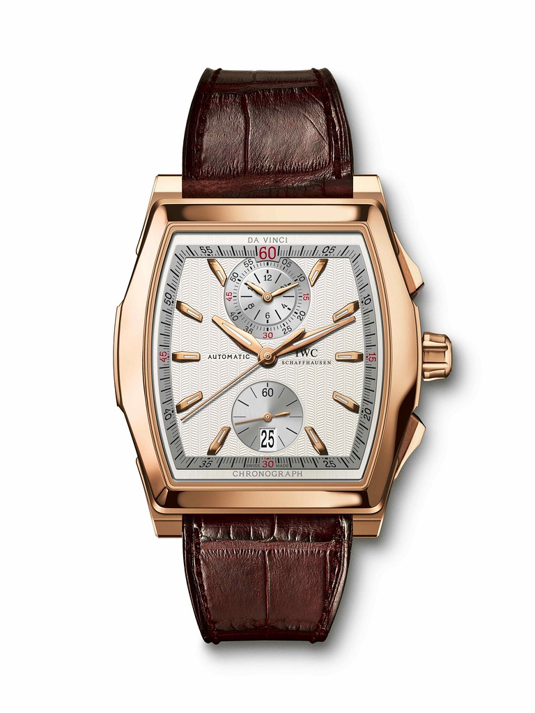
the IWC Da Vinci in rose gold, which I find oddly beautiful, was inspired by the genius' architecture (photo via IWC)
Each watch company has its own character, and merits that come with it. I think Rolex watches are timeless and masculine and at the same time quite flashy, while Cartier’s are classic French and very much jewelery-oriented. What is IWC?
Ours are iconic. IWC stands for technical and masculine design – a kind of ‘no frills’ design. Most of our references are still very close to the simple archetype of a wristwatch: round case, four lugs and depending on the function, three of more hands. Our approach is design with a rational behind, be it functional or historic, - not just simple ‘styling’. The Big Pilot’s watch is a perfect example for that: It is big to be able to carry a bigger and more accurate pocket watch movement. The case of this former military watch had to be sturdy and easy to manufacture. The dial had to be perfectly legible day and night, which resulted in a clean graphic layout fitted with luminous indexes and hands.
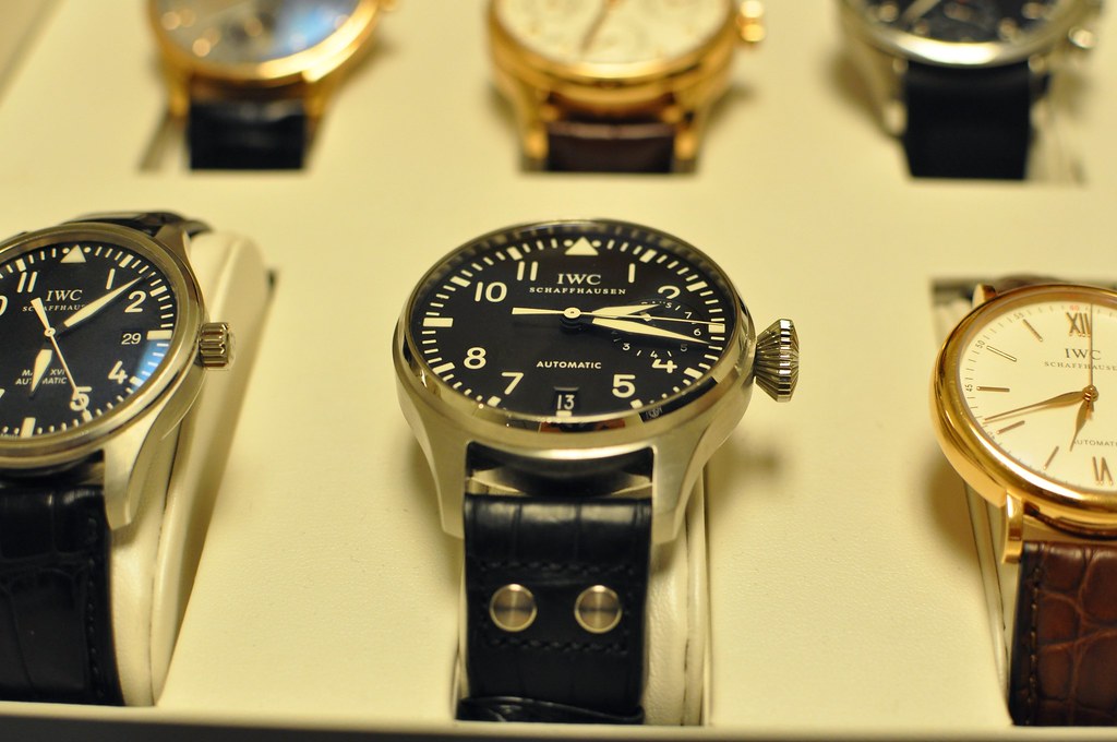
the IWC Big Pilot's watch
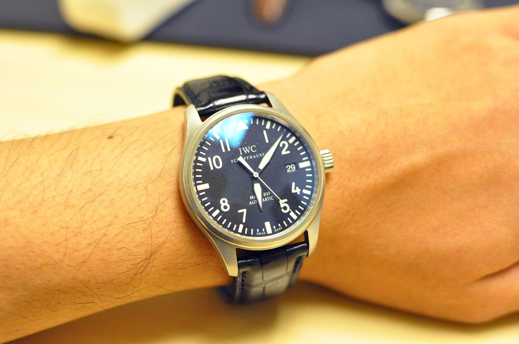
and the smaller Pilot's watch, a great basic everyday timepiece
From what I read, the Portuguese has been the “large wristwatch” long before it was fashionable for men to wear large watches. It is evidently large, but it is way more subtle and gentle in its largeness that most large timepieces in the market. Could you tell me more about the Portuguese’ design?
As described earlier with the Big Pilot, the size and the design of the Portuguese is more than a design feature or a trend. Historically the very first Portuguese watch from 1939 was next to the Pilots one of our first wrist watches to carry a pocket watch movement. Due to the size difference of the movement, pocket watch movements are more accurate and robust than the smaller movement used for wristwatches at that time. This principle of a maximum of robustness and accuracy is still one of our core brand assets. In terms of aesthetics the Portuguese - with its sleek case, typical numerals on the dial and the ‘feuille’ shaped hands - became an icon of timeless design. Characteristics that became signature elements of this specific line and which hardly changed over the last 70 years.
My favorite design element of the Portuguese, in my opinion, are the cut-off Arabic numerals (where they are overtaken by the chronograph circles). Tell me more about that…
That’s exactly what I mean and why true icons are so difficult to create. It’s not just numerals on the dial, but it is special typeface with details that make this watch so special and give this watch this unique and sophisticated look. Besides all rationales it remains important to play with these unexpected elements which give character to our products.
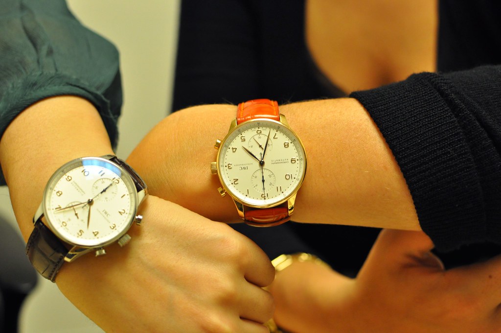
the Portuguese chronograph on IWC's Grace Kim and Lisa Brown
What do you think about the trend in large watches that has been going on for quite a while now?
We don’t care about trends so much at IWC. The reason for the size of our watches is purely technical. It is about the big and robust pocket watch movements we put inside since more than 70 years. But you are right, doing that we became a kind of trendsetter for big watches a few decades later. Personally, I think that with a diameter of 45/46mm the watch industry reaches the maximum in terms of wearability. At IWC we are doing enormous efforts to work on the ergonomics and make these watches comfortable to wear. IWC will keep doing big very masculine watches, but the trends might have passed its zenith already a while ago.
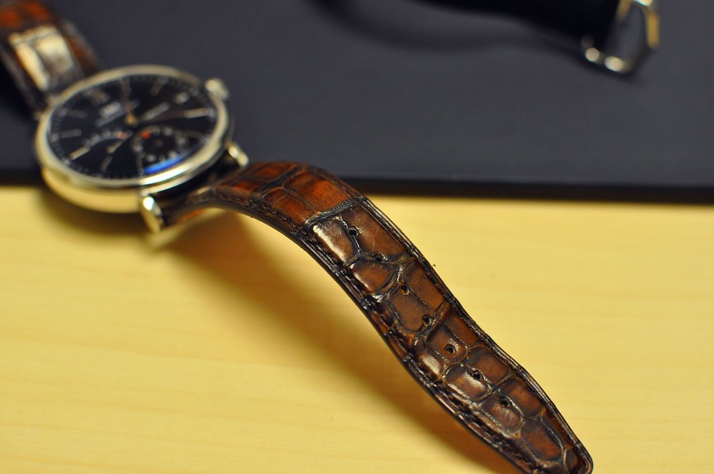
a rich multi-toned alligator strap by Santoni on an IWC Portofino
On the topic of trends, what role does fashion play in your design process? What do you think of the recent movements in fashion that favor minimalism? Androgyny? Exotic leathers?
Fashion trends have no direct influence on our design process. But for sure we can ignore the same economic changes and changes on behavior in our society which influence fashion as well. Fashion and design work as an indicator of cultural changes. Take the example of the revival of the 50ties and 60ties. This is not just a fashion trend. The interest in more classic shapes and timeless styles was a post crisis effect and perfectly describes the consumers’ needs for something different and sustainable after the exuberant years before. However the IWC brand stands for pure and timeless style: already we noticed an increasing interest in our classic pieces, our well established product lines and calm color combinations.
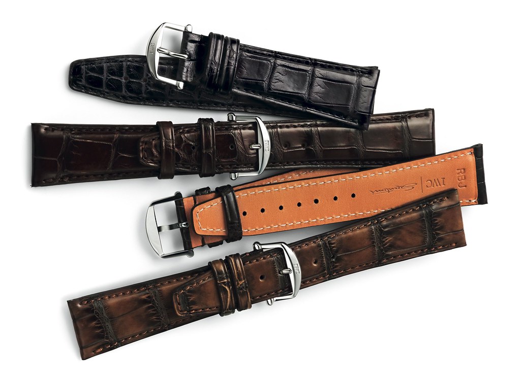
straps by Santoni (photo via IWC)
I’m seriously considering a Portofino automatic in steel (with the chain mail bracelet) as a nice simple everyday watch. What do you think?
Excellent choice. I’m very glad that the chain mail bracelet is so well received. We worked hard convincing all retail partners to introduce it, but I believe it perfectly fits the Portofino design and makes this classical watch a statement. Check the Portofino chronograph with black dial and this bracelet – a bit sportier, but a great combination as well.
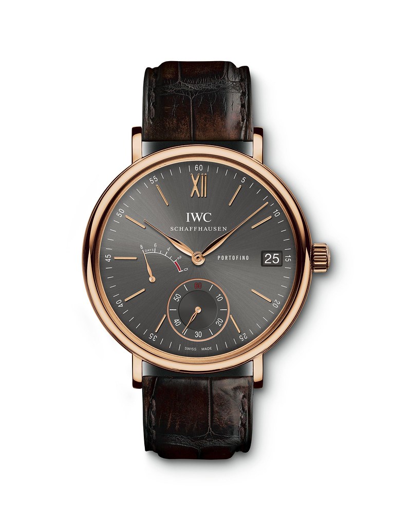
the Portofino in rose gold: rich, cool, and dignified (photo via IWC)
Will smartphones ever replace wristwatches?
I don’t believe that smartphones will ever replace wristwatches. We are already in the lucky position that we manufacture a product nobody needs but (almost) everybody wants. Our products are highly emotional and serve more needs than just displaying the correct time. People buy mechanical watches because they are fascinated by a mechanic micro universe, interested in traditional craftsmanship, the unique heritage of a brand with more than 100 years of history or just a piece of men’s jewelry to expressing their style.
What can we expect from IWC in the future?
We will be faithful to our heritage as an innovational brand that creates icons in the watch industry. We will build the future on our brand values of a technical and masculine design and will evolve our product families while respecting the design codes of these icons.
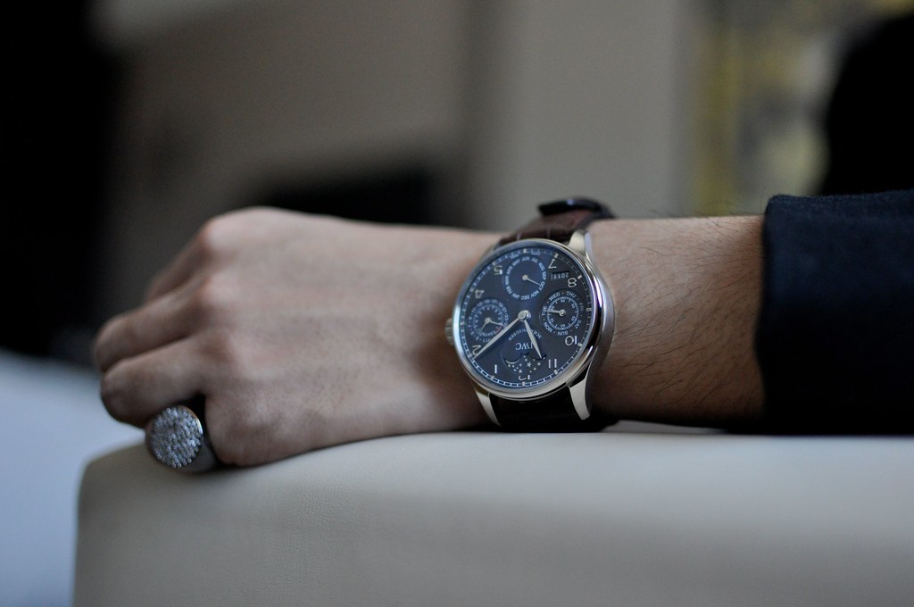
my father's newest IWC Portuguese Perpetual Calendar in white gold, on loan to me for a short while. Taking it off was tough.
special thanks to Christian Knoop, Grace Kim, Lisa Brown, and Oliver Siegle of IWC and to Nikki Tuason for taking the last photograph






No comments:
Post a Comment